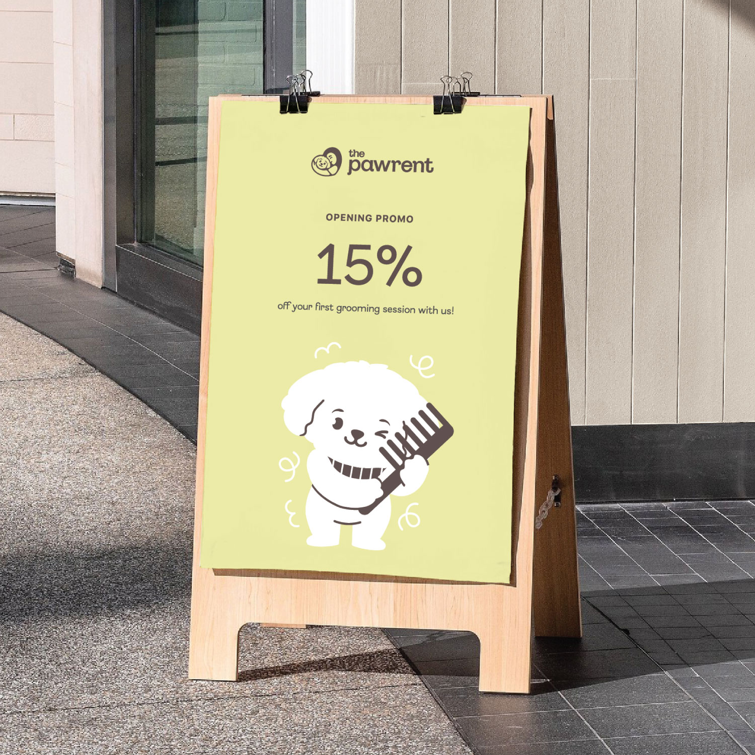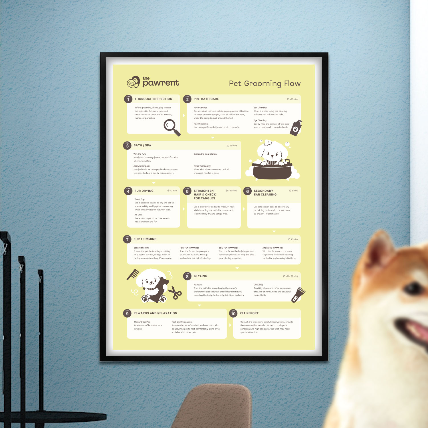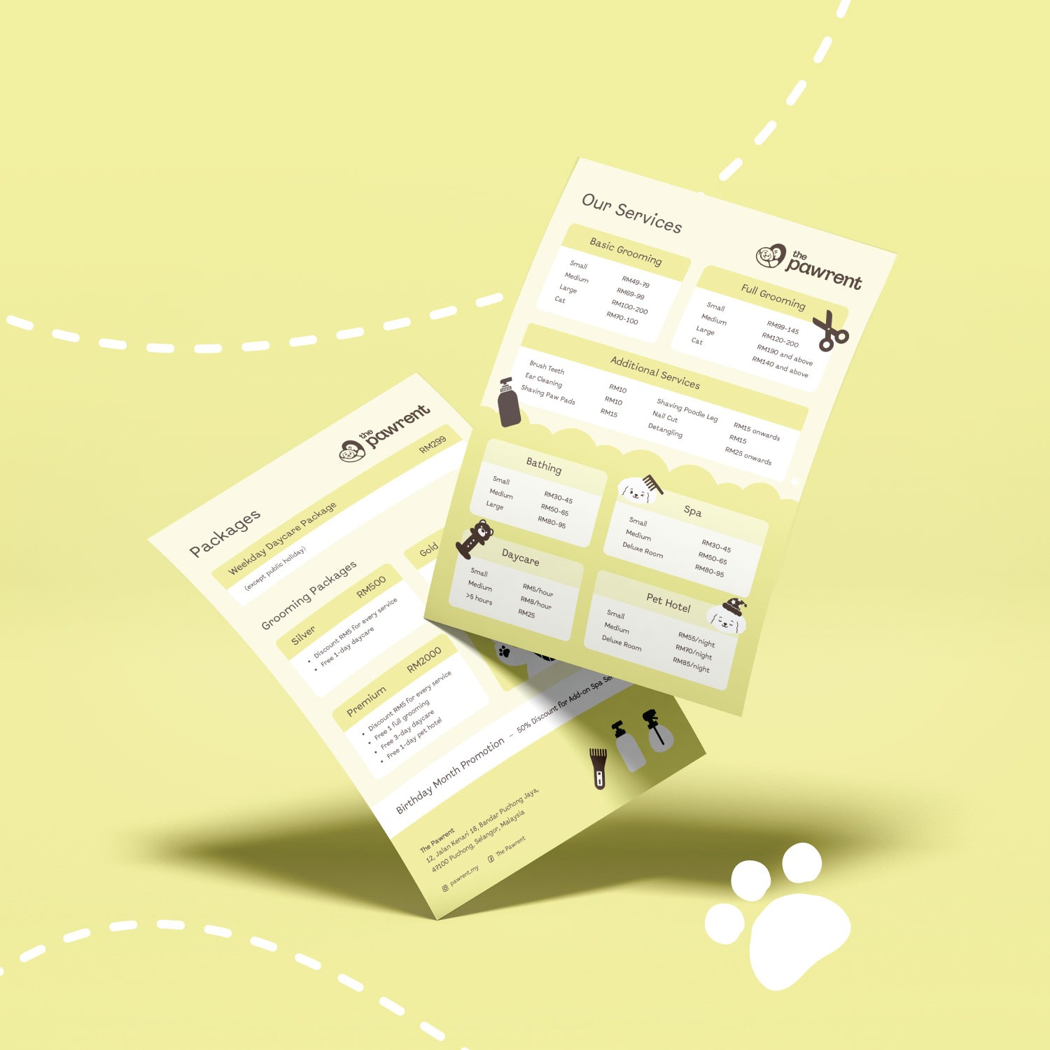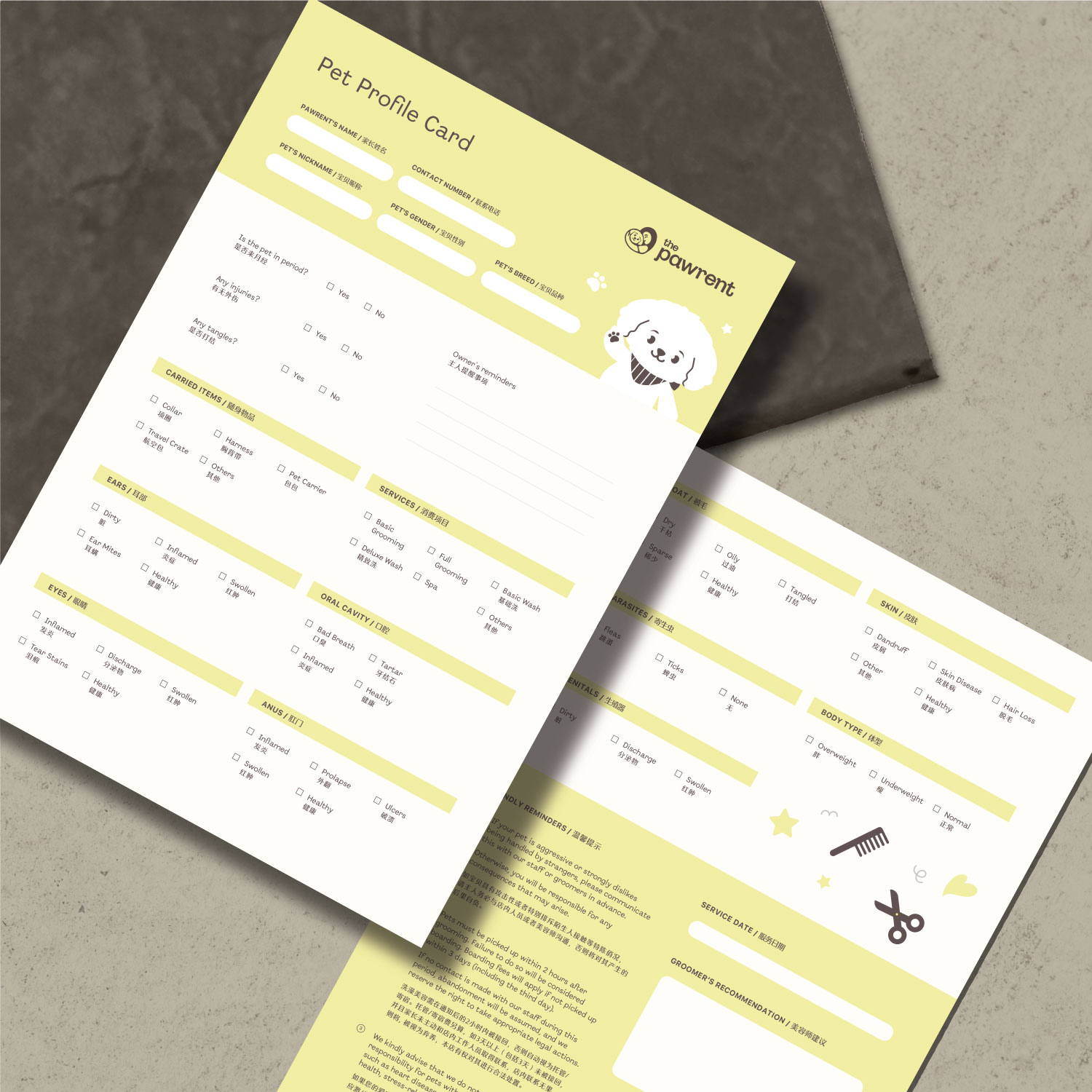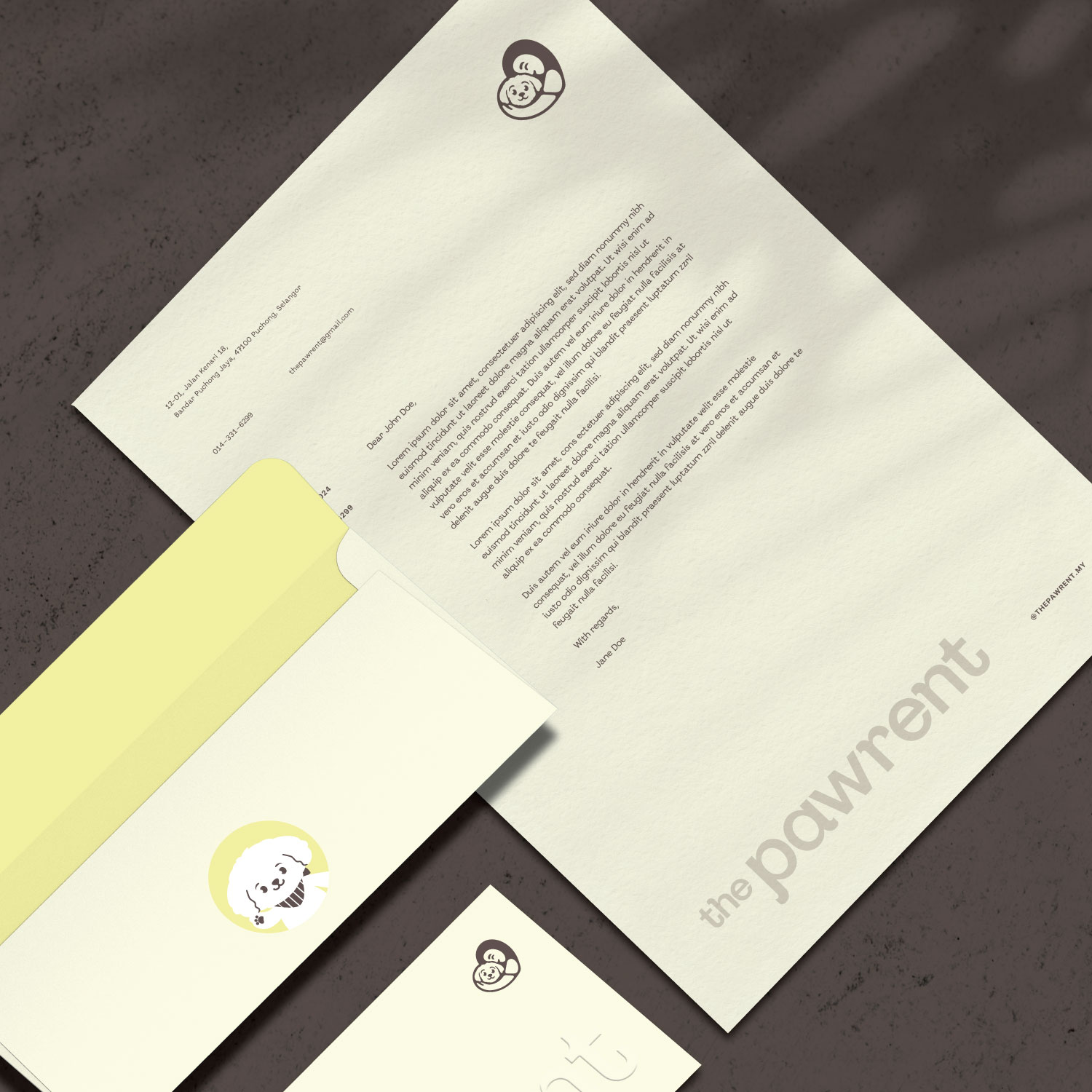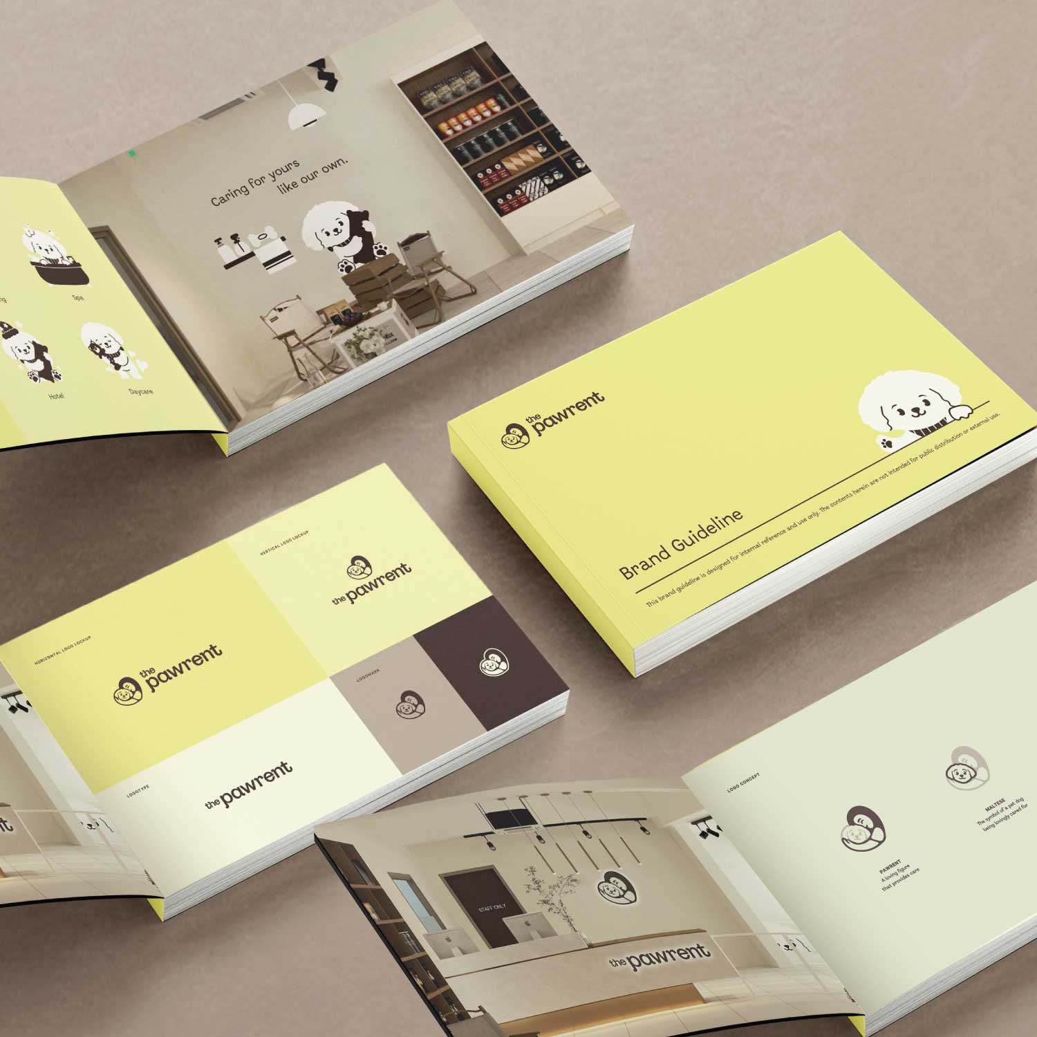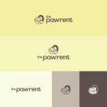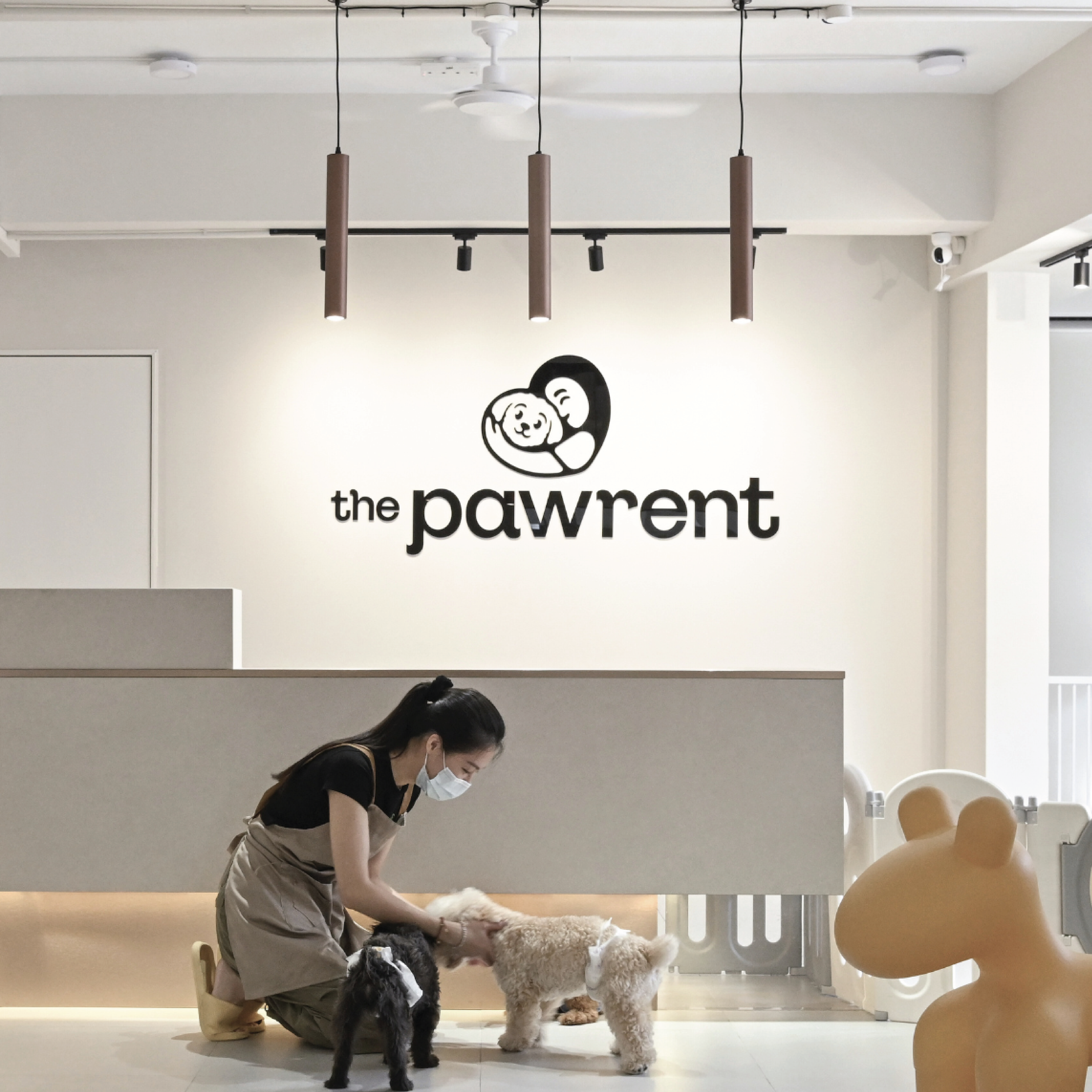

The Pawrent was born from a deep love for dogs, with the aim of providing reliable, loving care to every pet that walks through the door. The name reflects the owner’s dedication to treating every pet like family.
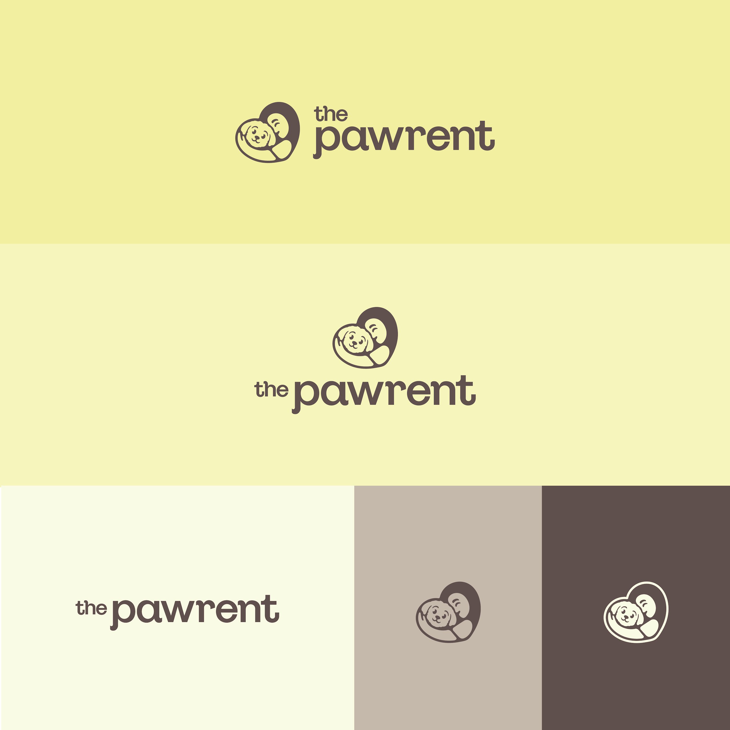
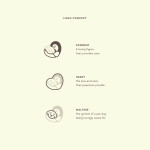
The logo itself is inspired by the owner’s nurturing role towards her Maltese, overall shaping a heart that symbolizes the love and care pawrents give to their furry companions – a visual representation of the brand’s caring nature.

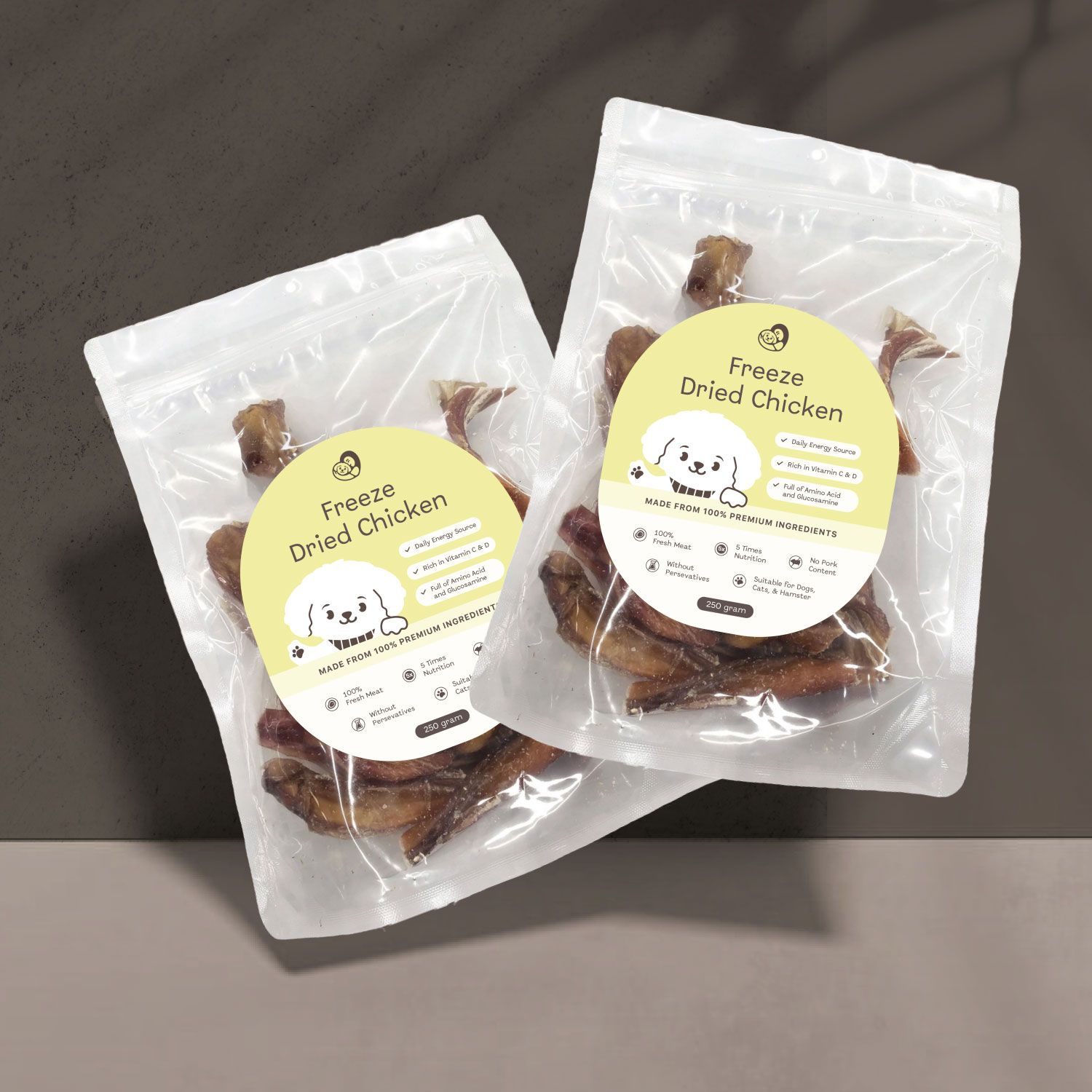
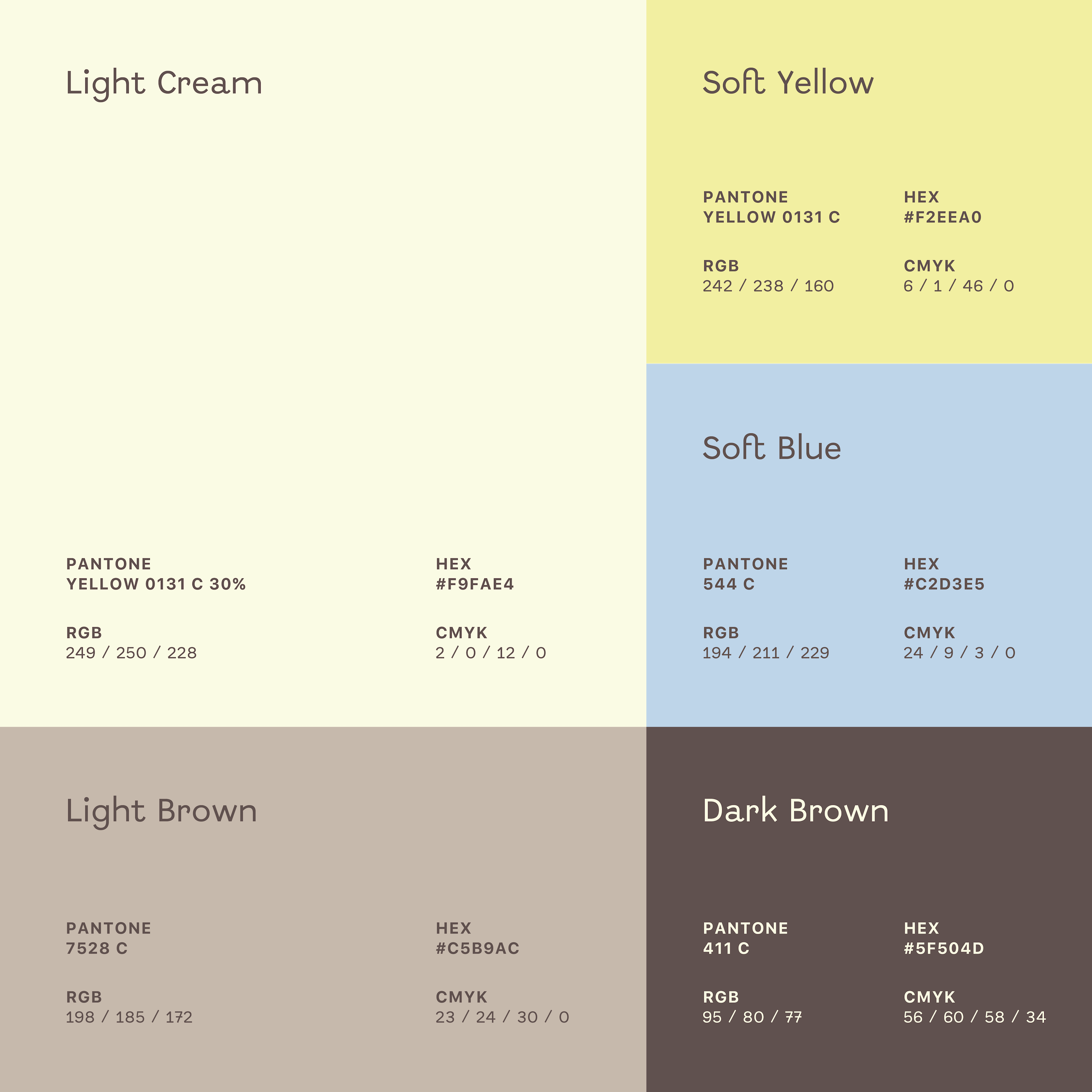
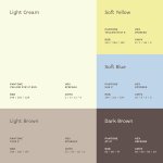
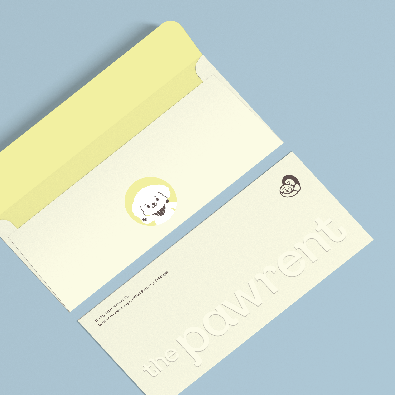
The warm color palette of beige and brown – highlighted with a bright, happy yellow and a calming light blue accent – reflects a safe, welcoming space for pets. Promoting both security and joy, these colors create a comforting atmosphere.
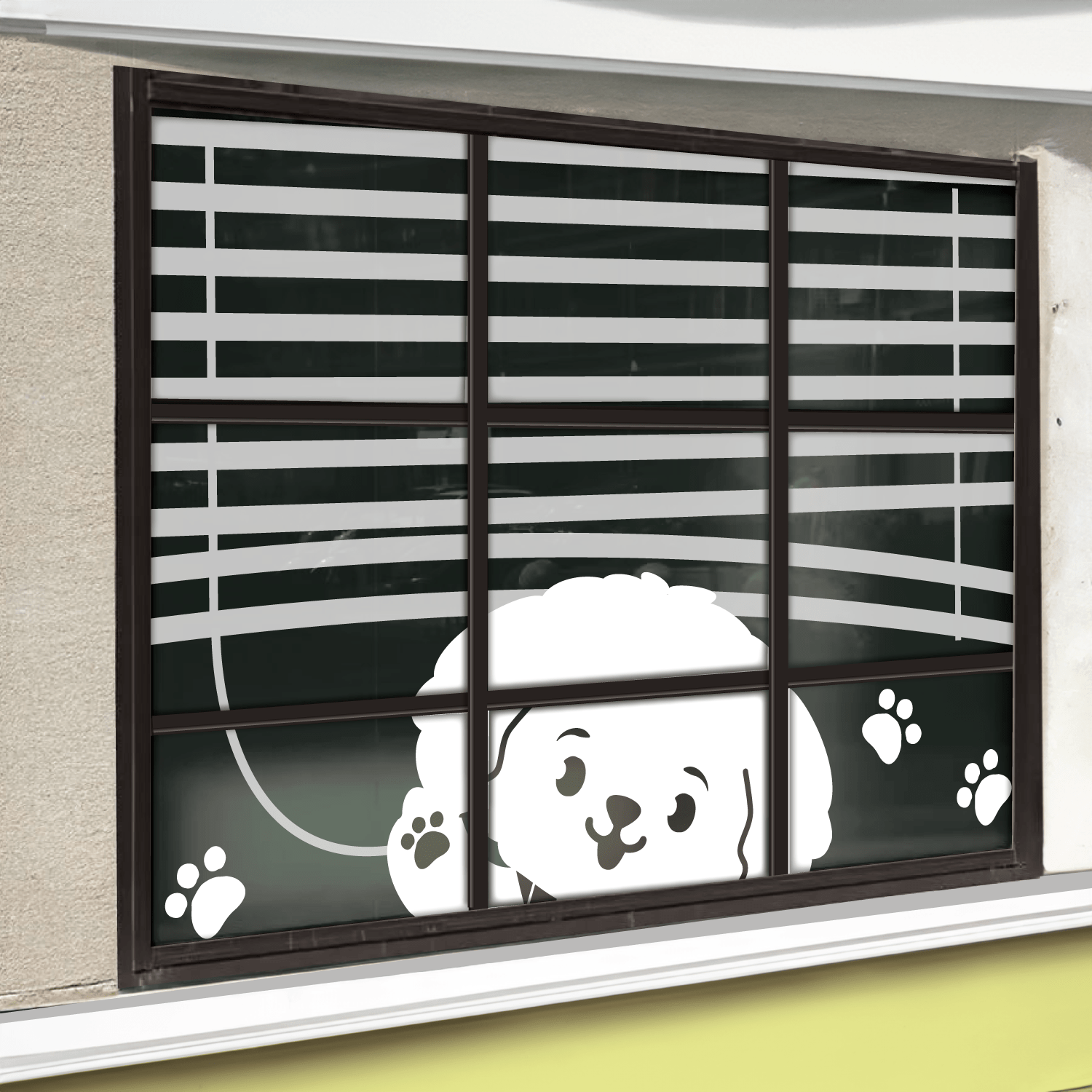
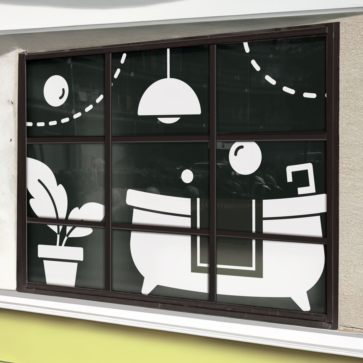
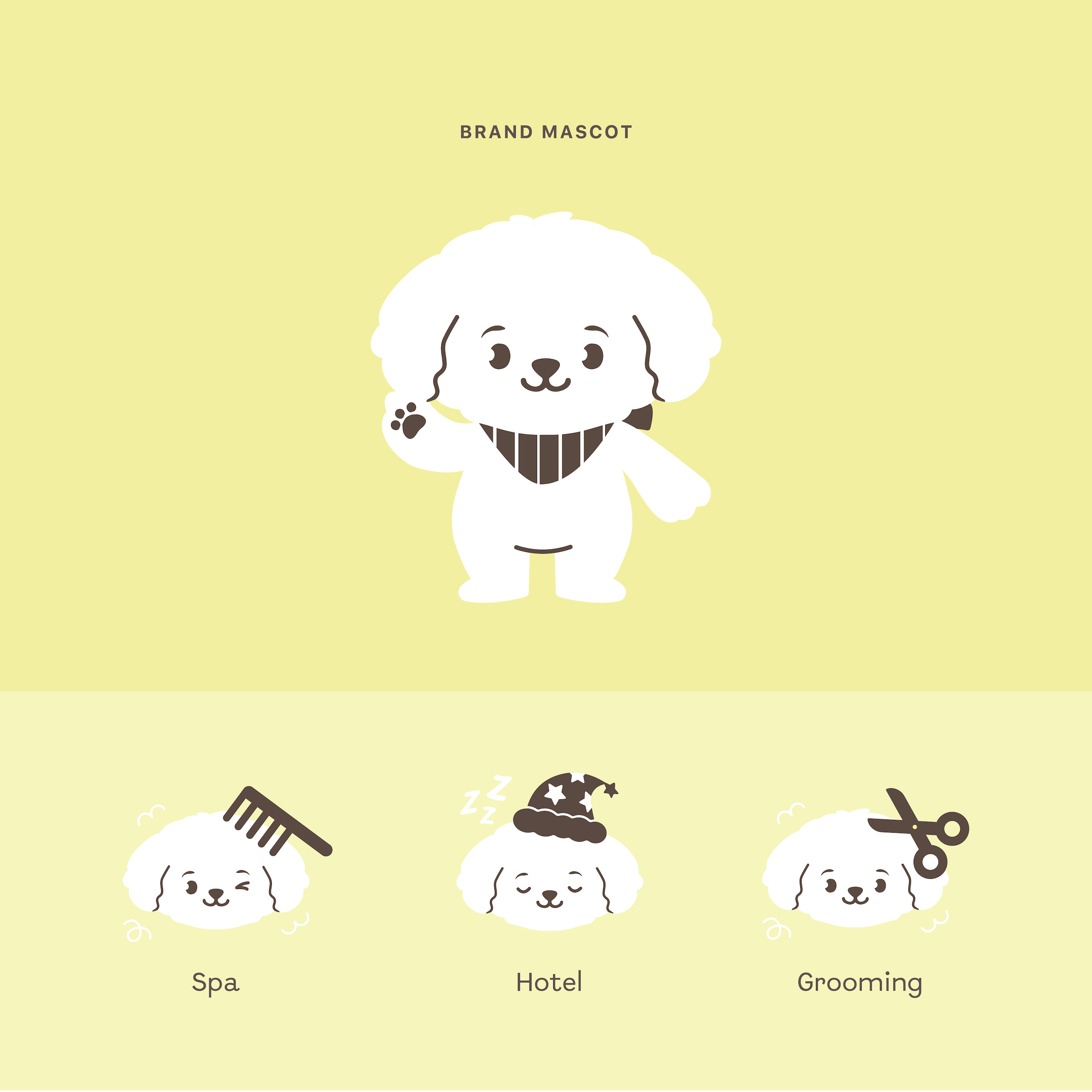
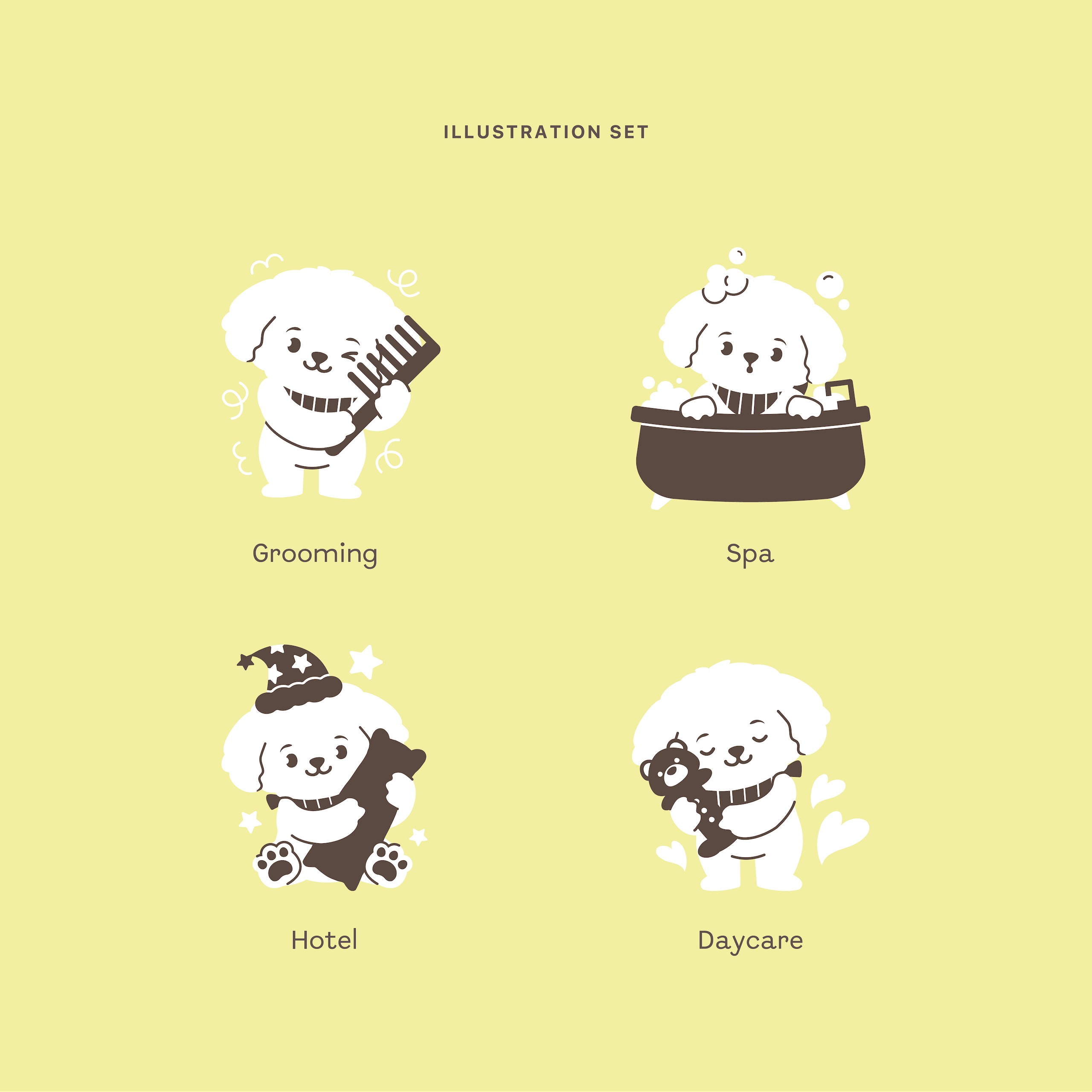
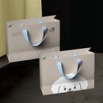
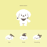
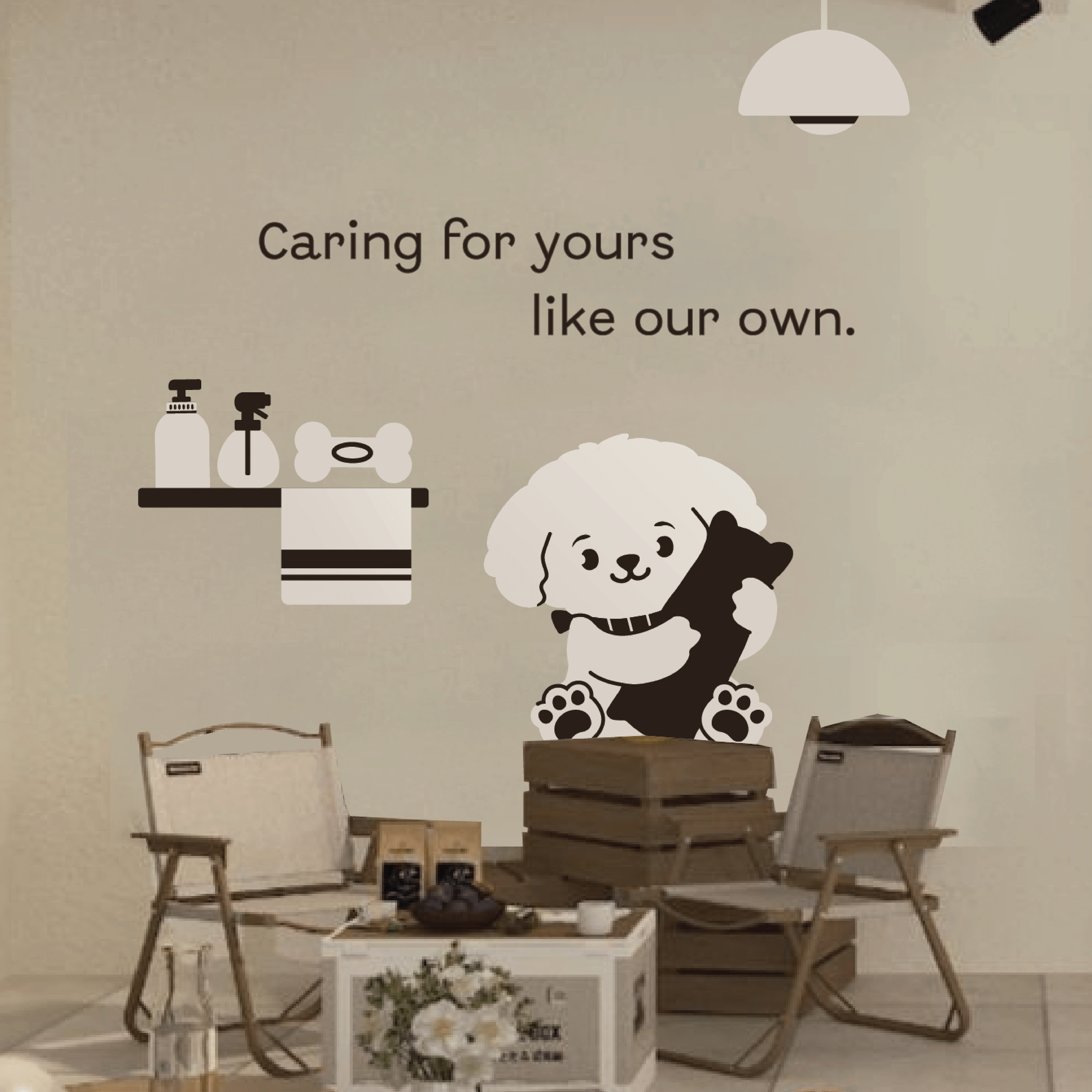
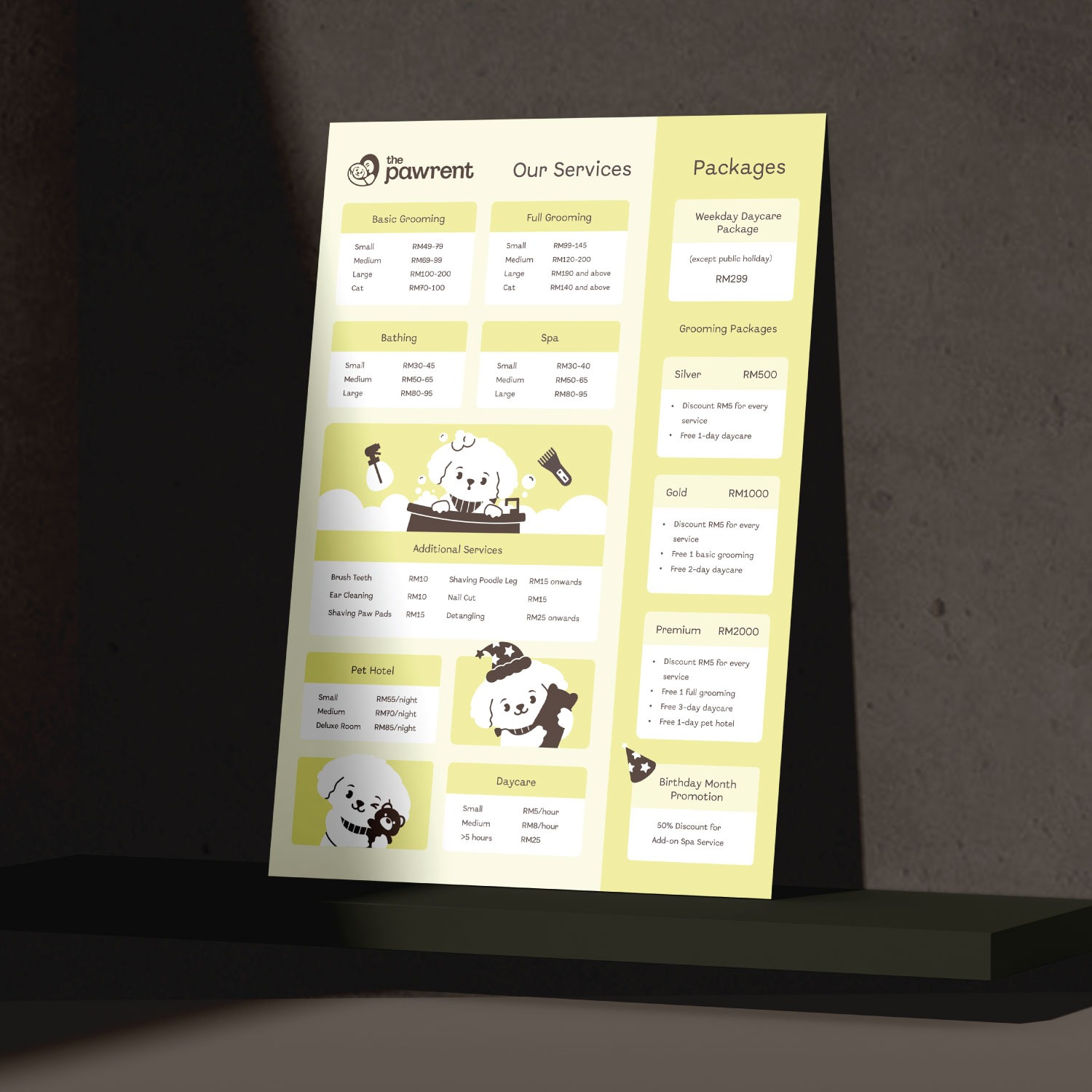
The brand’s mascot, designed after the owner’s Maltese, represents the shop’s wide range of services, including daycare, grooming, and spa. Its cute and simple design adds a playful, friendly touch to the overall identity.



At The Pawrent, they believe every pet deserves the best. Their tagline, “Caring for yours like our own,” reflects their unwavering commitment to providing top-tier care in a clean, comfortable, and welcoming environment.

