Founded in 2017 with a modest 1400 sq ft space and a passion for building community, INFINITY8 has since grown into a vibrant ecosystem designed to inspire creativity, fuel productivity, and foster collaboration, while offering tailored business solutions to support growth and connection.
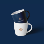
As the brand evolved, the need to rebrand arose to better reflect its growth, innovation, and commitment to empowering communities – featuring a refined logo with the same infinite eight paired with a customized logotype.
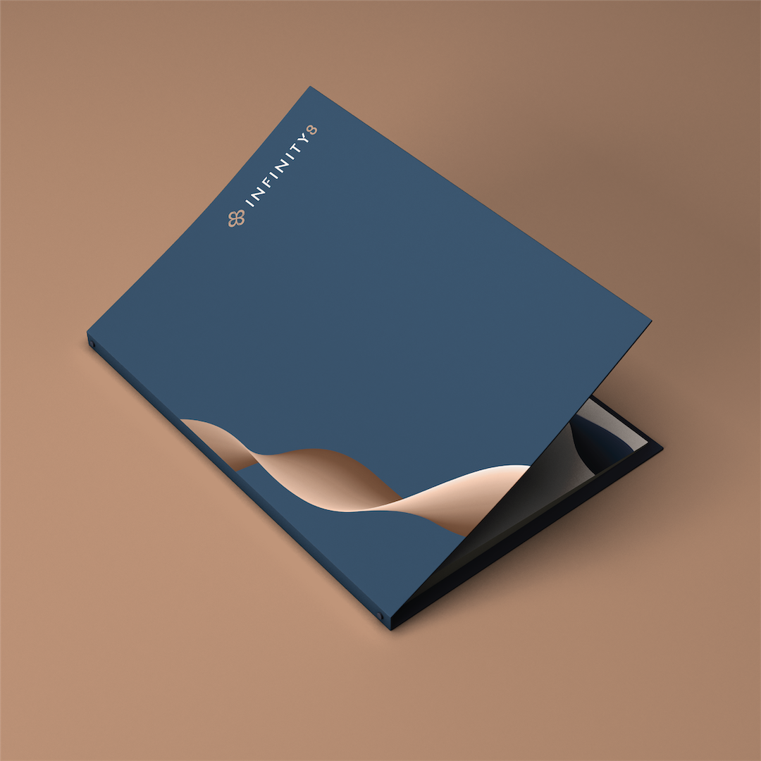
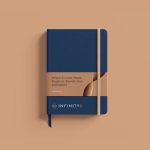
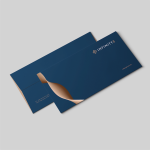
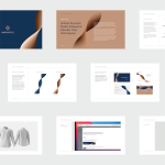
Symbolizing connection and growth
The refreshed identity introduces the whirl graphic element that symbolizes energy, social connection, and forward motion. This dynamic feature reflects the constant drive for progress, capturing the vibrant buzz of activity and collaboration that defines INFINITY8’s spaces.
The whirl also represents the members’ journey within the community, highlighting how they interact, connect, and grow. Its sweeping lines and bold design accentuate the brand’s essence – an ecosystem of boundless possibilities that fosters success and innovation.
A rebrand that captures the brand's evolution into a dynamic ecosystem.
Through this revitalized identity, INFINITY8 reinforces its position as a trusted workspace provider and community builder. The refreshed design not only celebrates its evolution but also amplifies its commitment to empowering businesses and individuals in a space where creativity, collaboration, and growth thrive.